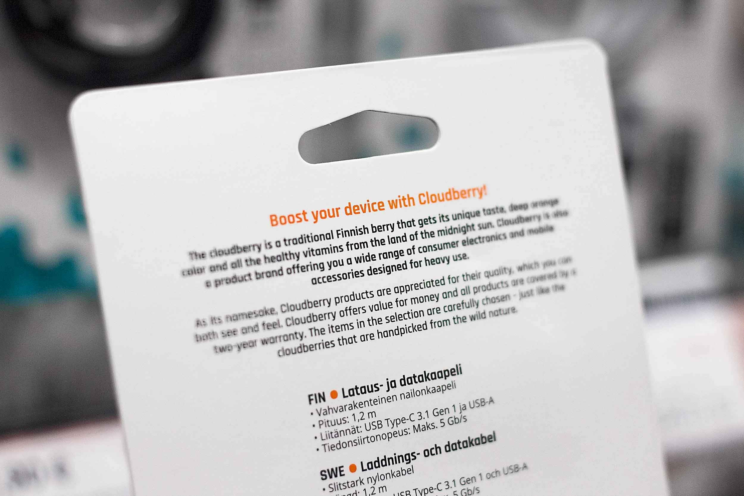
Cloudberry by Motonet Oy“Consumer electronics and mobile accessories designed for heavy use.”


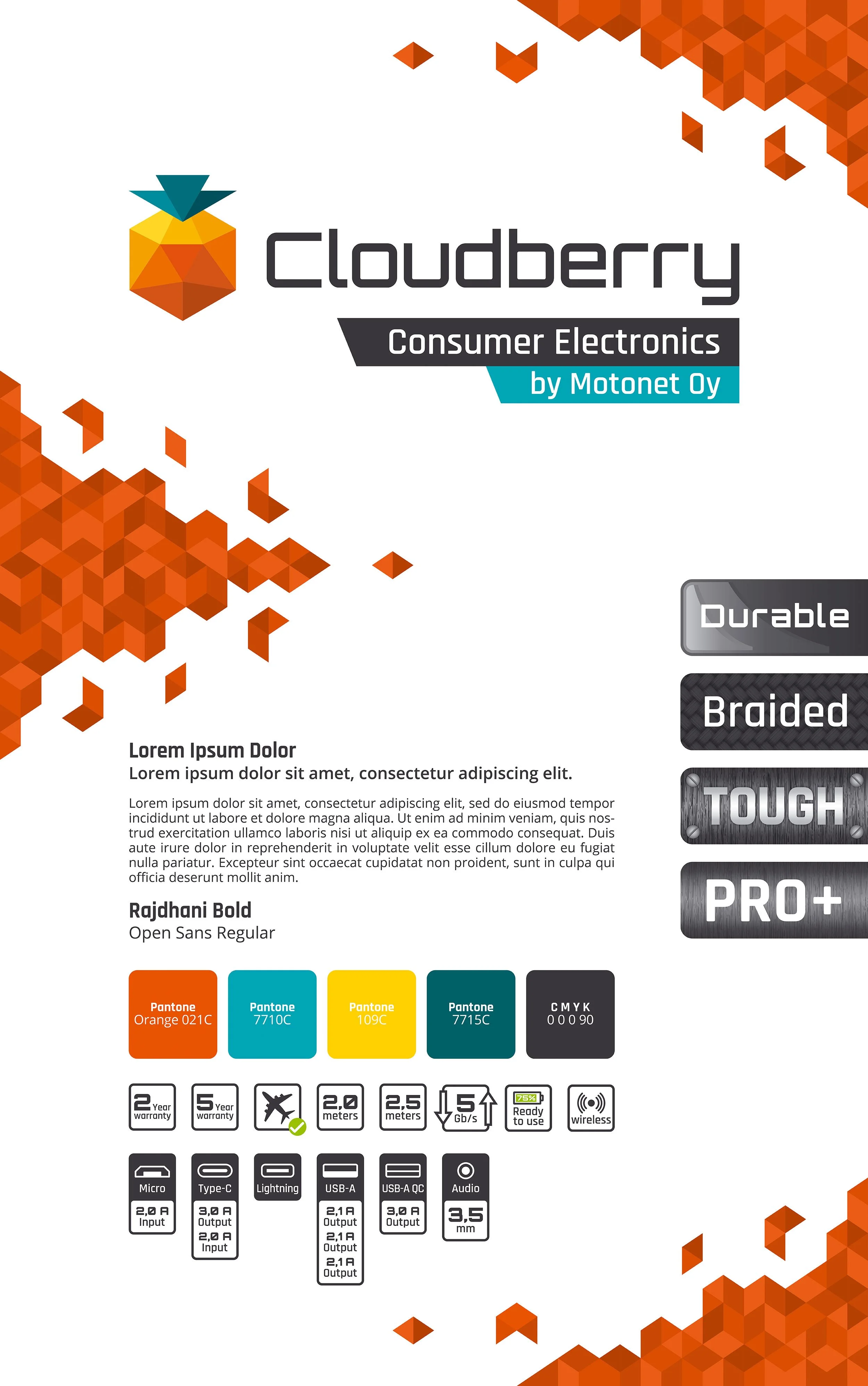
The visual identity was built around balancing durability with a clean, contemporary expression. A bold color system was introduced, using five core colors paired with secondary tones to divide the product range into clear categories without fragmenting the visual identity.
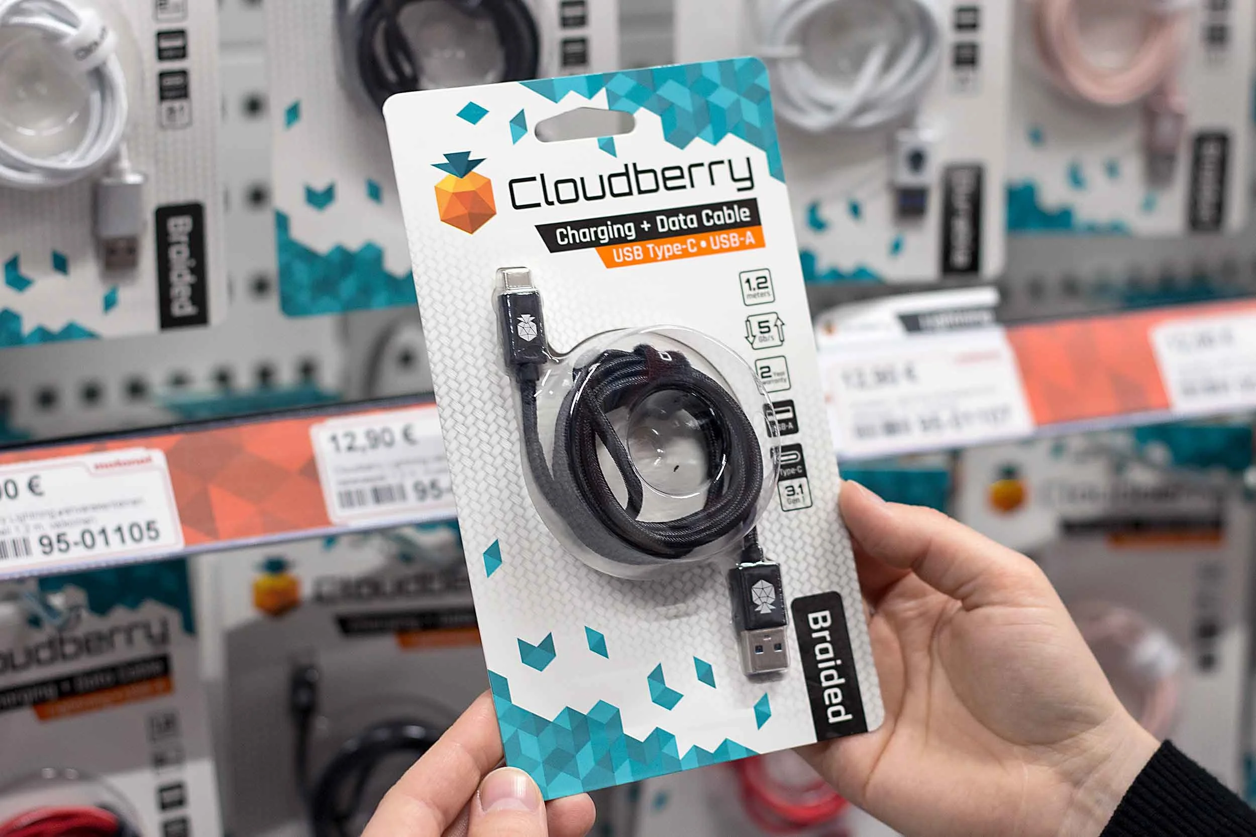
Iconography played a central role in the packaging design. With limited space and highly competitive shelf space, the system was designed to communicate the most important product attributes quickly and clearly, supporting fast purchasing decisions.
The result is a bright and structured packaging system that feels youthful and approachable, while reinforcing Cloudberry’s promise of quality and long-lasting performance.
ClientMotonet Oy
Broman Group Oy
RoleArt Direction
Visual Identity Development
Logo System Design
Iconography Sourcing & Design
Pattern Sourcing & Design
Packaging Design & Implementation
Material Selections
Print Proofing & Approval
The BriefCloudberry is a consumer electronics and mobile accessories brand introduced by Motonet Oy in 2019. The goal was to create a product range designed for heavy use, with all products backed by a minimum two-year warranty.
To reach a younger audience, the visual identity needed to feel modern, confident and eye-catching, while still communicating reliability and quality in a crowded retail environment.
The SolutionNotesThe project was conducted on an employment basis and as a collaboration between Motonet Oy’s marketing department and the product manager(s) in charge of the product range.


Book discovery callReady to work together?
If you’re ready to explore working with us, skip the inbox and head straight to the booking page to schedule a free discovery call. We’ll chat about your goals and how we can help you get there.