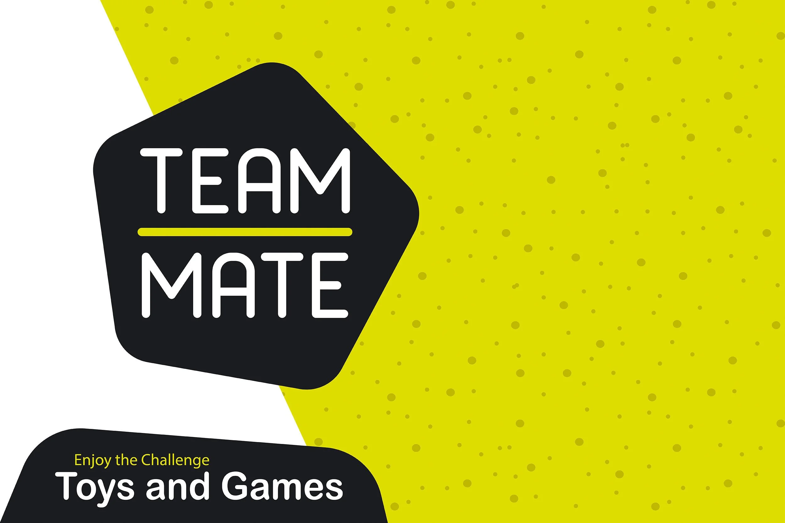
Teammate by Motonet Oy“Inviting both kids and adults to enjoy the challenge of outdoor games and activities.”


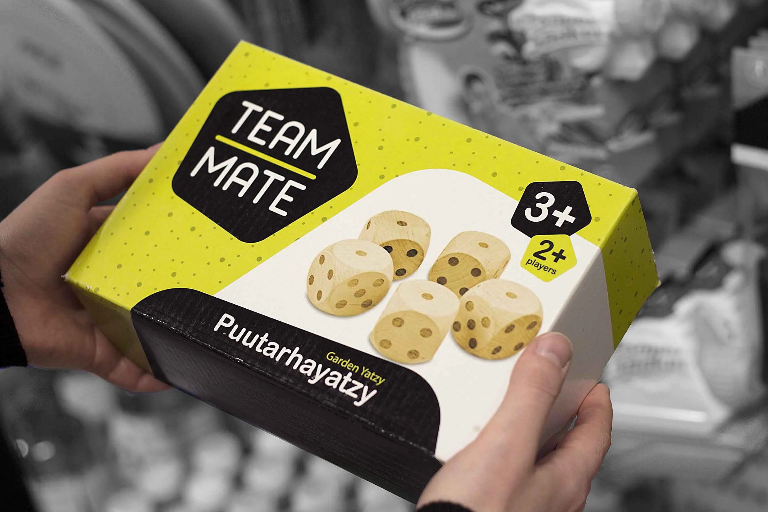
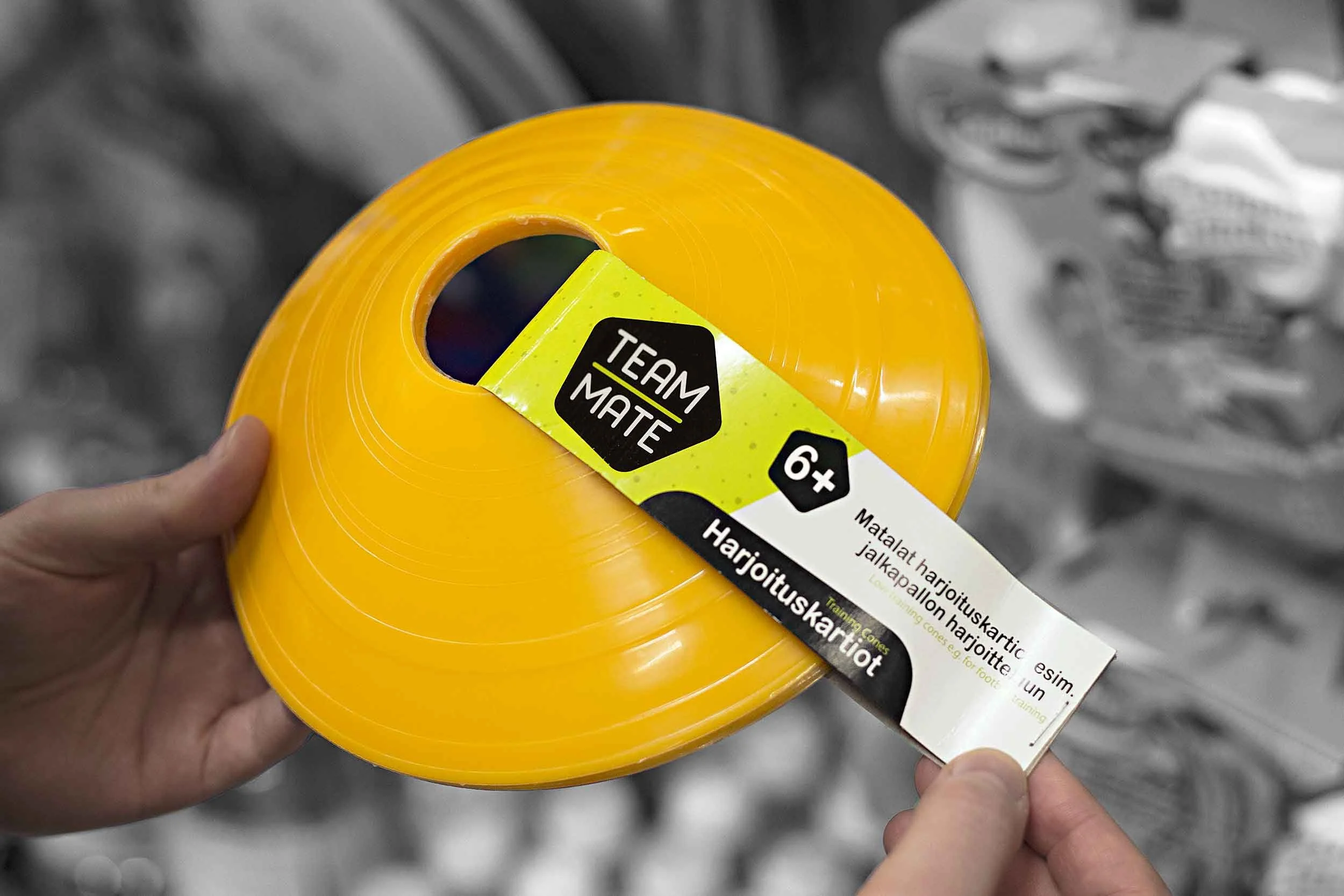
Teammate is Motonet Oy’s first private label brand focused on games and activities. The initial product range included toys and outdoor games, but the brand also needed to be flexible enough to support future product categories as it grows.
The challenge was to create a brand that feels playful and energetic for children, while still appearing modern and trustworthy to the actual decision-makers: the parents.
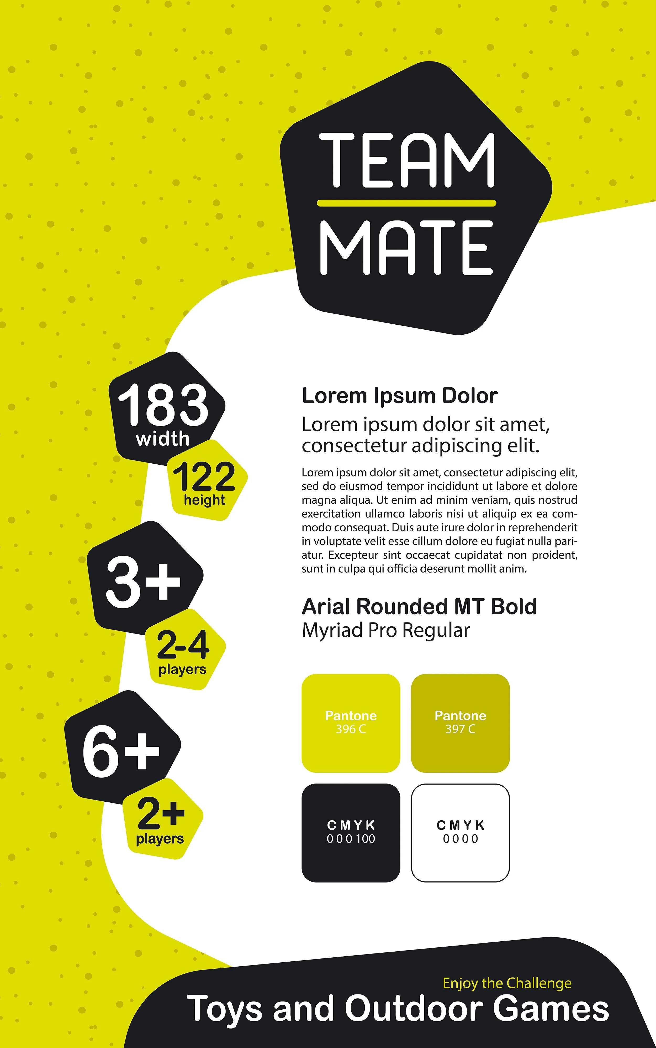
To stand out in a category often dominated by loud, cluttered visuals, we chose a cleaner and more contemporary design approach that balances playfulness with clarity. A bright yellow was selected as the main brand color, creating strong shelf visibility, while black and white details keep the overall expression structured and easy to read.
A modular pattern system built from pentagon shapes became a key visual element. The pattern adds movement and personality to the brand, while also functioning as a flexible layout tool across packaging, marketing and in-store communication.
To support future expansion, the color system was designed so the core yellow can easily be replaced or complemented with additional colors, allowing new product categories to be introduced without losing brand recognition.
ClientMotonet Oy
Broman Group Oy
RoleArt Direction
Visual Identity Development
Logo System Design
Iconography Design
Pattern Sourcing & Design
Packaging Design & Implementation
Material Selections
Print Proofing & Approval
The BriefThe SolutionNotesThe project was conducted on an employment basis and as a collaboration between Motonet Oy’s marketing department and the product manager(s) in charge of the product range.
Book discovery callReady to work together?
If you’re ready to explore working with us, skip the inbox and head straight to the booking page to schedule a free discovery call. We’ll chat about your goals and how we can help you get there.