Roastmaster by Motonet Oy“Cookware and barbecue equipment for basic, premium and professional use.”


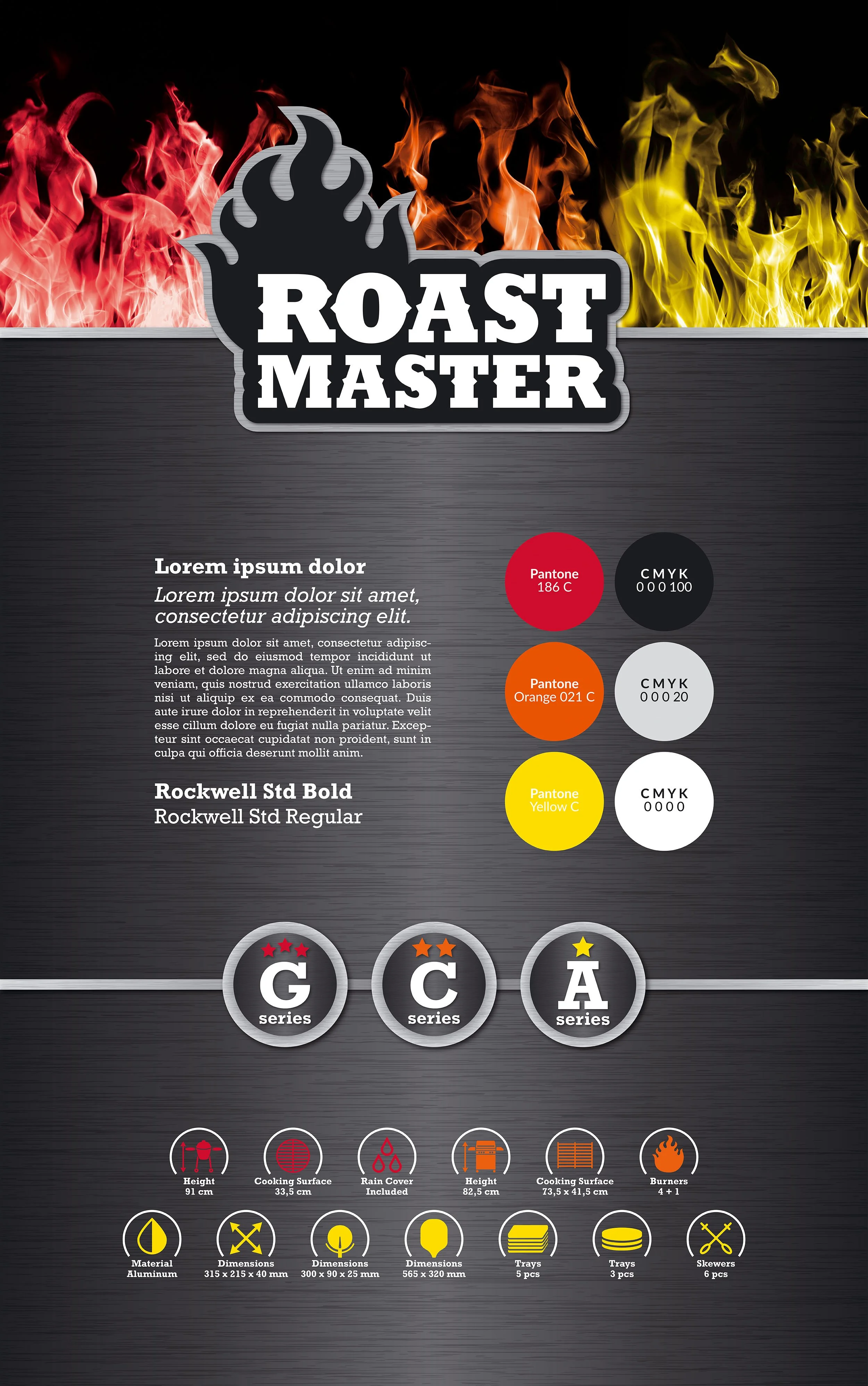
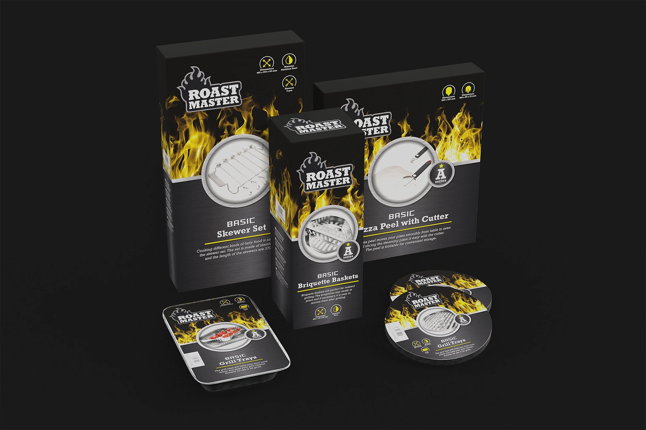
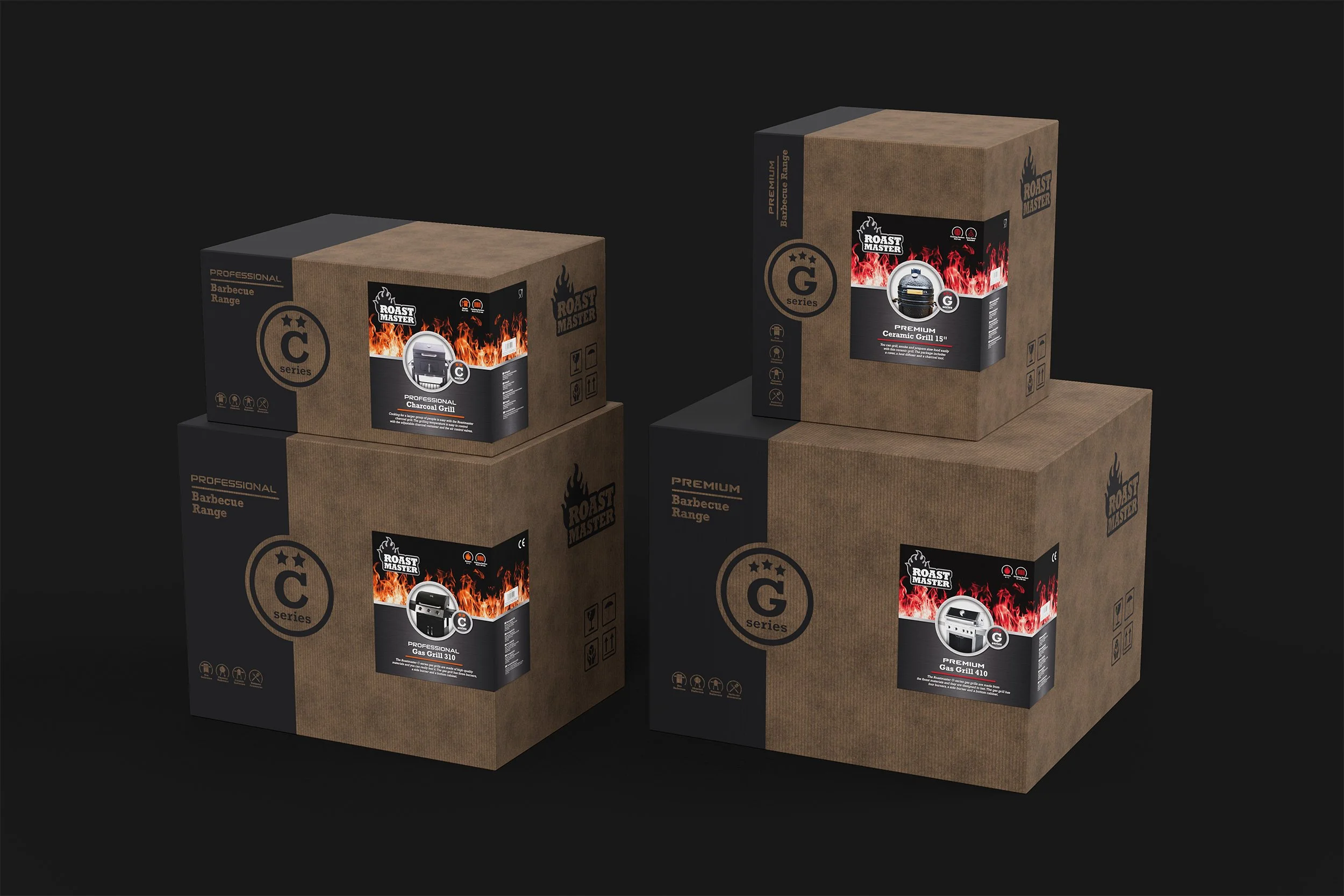
The visual identity for Roastmaster was built around clarity and hierarchy. To support the three price tiers, each category was defined by a clear positioning: basic, professional and premium. These distinctions guided both the visual language and the information hierarchy on the packaging.
A color-coded system was introduced to separate the tiers, while all other visual elements remained consistent to maintain strong brand recognition. This approach allows customers to quickly understand the product level at a glance, both on shelf and in-store.
Special attention was also given to the scale of the packaging. Some products required large outer cartons that would be displayed directly in-store, and the identity was designed to translate seamlessly across both small packaging and large-format cartons, ensuring a consistent perception of quality across the entire range.
ClientMotonet Oy
Broman Group Oy
RoleArt Direction
Visual Identity Development
Logo System Design
Stock Imagery Sourcing
Iconography Sourcing & Design
Pattern Sourcing & Design
Packaging Design & Implementation
Material Selections
Print Proofing & Approval
The BriefMTX Barbecue was Motonet Oy’s first private label barbecue brand. As the category strategy evolved, the brand was repositioned and renamed Roastmaster. The new Roastmaster range was structured into three price tiers: G, C and A series, and the visual identity needed to clearly communicate the differences between these categories while remaining cohesive as a single brand.
The SolutionNotesThe project was conducted on an employment basis and as a collaboration between Motonet Oy’s marketing department and the product manager(s) in charge of the product range.
Book discovery callReady to work together?
If you’re ready to explore working with us, skip the inbox and head straight to the booking page to schedule a free discovery call. We’ll chat about your goals and how we can help you get there.